Do you know that most people use the internet on their phones? That’s right, so having a website that works well on phones is essential. However, if your website is optimized for mobile devices, it can be easy to use and slow to load, frustrating visitors. In this article, I’ll explain what “mobile-friendliness” means and give tips on ensuring your website is mobile-friendly.
It is important to be mobile-friendly because most people use their phones to get online. If your website isn’t made for mobile devices, it might not work right on a phone or tablet. This makes reading, finding your way around, and using the website hard. Because of this, people may leave your site for one that is easier to use on their phone. Also, search engines like Google like websites that work well on mobile devices. If your site isn’t optimized for mobile, it may not rank as high in search results.
Did you know that over half of all internet traffic comes from phones and tablets? Yes, more than half of the people who visit your website do so on a phone or tablet. However, studies have also shown that people are more likely to leave a website that needs to be mobile-friendly. For example, 57% of users say they will only recommend a business with an excellent mobile website. So, if you want as many people as possible to visit your website and stay interested, it is essential to ensure it is mobile-friendly.
What is mobile friendliness?
The term “mobile-friendliness” means how well your website looks and works on a mobile device. A mobile-friendly website is made to fit the screen of a smartphone or tablet and to be easy to use with a touch screen. It is vital for SEO and user experience that a site works well on mobile devices. It is different from mobile responsiveness, which is the ability of a website to adapt to different screen sizes. Websites that are easy to use on mobile devices are more likely to rank higher in search results and keep people interested.
Importance of mobile-friendliness for SEO
Search engines like Google like websites that work well on mobile devices. Having a website that works well on mobile devices is vital for SEO. Google uses how well a website operates on a mobile device as a ranking factor, and mobile-friendly websites rank higher in search results. A website that works well on mobile devices will likely rank higher in search results and get more visitors. If your website isn’t made for mobile devices, it might not appear in search results for people who use mobile devices. This could mean less traffic and fewer possible customers.
Mobile responsiveness vs. mobile-friendly
Both mobile responsiveness and friendliness are similar, but they are not the same thing. The ability of a website to change its layout and content to fit different screen sizes is called “mobile responsiveness.” “Mobile-friendliness” refers to how easy it is to use on a mobile device. A website that works well on mobile devices might not be mobile-friendly, and vice versa. Focusing on mobile responsiveness and friendliness is essential to ensure your website works well on mobile devices. A website that is both mobile-friendly and mobile-responsive will give users a better experience and rank higher in search results.
How to Find Out if Your Website Is Mobile-Friendly
You can find out if your website is mobile-friendly in several ways. One way to do this is to use Google’s Mobile-Friendly Test, which looks at your website and tells you how well it works on mobile devices. You can also manually check how your website looks and works on different mobile devices. Google Search Console also has a report called “Mobile Usability” that shows any problems with how your website works on mobile devices. Using these tools, you can ensure your website works well on mobile devices and gives users a good experience.
Google Mobile-Friendly Test
The Google Mobile-Friendly Test is a free tool that checks how mobile-friendly your website is. To use it, you just need to type in the URL of your website and click “Run Test.” The tool will then look at your website and report how mobile-friendly it is, including any problems that need fixing. The information will also tell you how to fix the issues and improve your website for mobile users. With Google’s Mobile-Friendly Test, you can ensure that your site works well on mobile devices and gives users a good experience.
Manual checking on multiple devices
You can also ensure your website is mobile-friendly by checking it on multiple devices by hand. You can use smartphones and tablets, among other things, to see how your website looks and works on different-sized screens. Doing this lets you find any problems and make the necessary changes to improve the mobile user experience. It is essential to test your website on various devices, operating systems, and browsers to make sure as many people as possible can use it.
Checking mobile usability in Google Search Console
Google Search Console has a “Mobile Usability” report that tells you if your website works on mobile devices. In addition, the report tells you about any errors or issues affecting your website. You can find problems and take steps to improve your website for mobile users. This can help ensure mobile device users can access your website.
Read Also: 6 Top KPIs for a Successful Small Business Website
8 Ways to Make Your Website Mobile Friendly
You can do a few things to make your website easy to use on mobile devices. Using these tips, you can make your website more mobile-friendly and give visitors who use mobile devices a better experience. These tips are:
1. Using a responsive web design
This is an excellent way to make your site work well on mobile devices. A responsive design ensures that your website adjusts to different screen sizes, making it easy to use and navigate on mobile devices. This can improve the user’s experience and keep people on your website for longer. In addition, by using a responsive web design, you can ensure that people using various devices can easily access and use your website.
2. Optimize images for mobile devices
For your website to be more mobile-friendly, you must ensure that images are optimized for mobile devices. Large images can make it take longer for your website to load, making it hard for people to use. To make your pictures work best on mobile devices, you can compress them to reduce their file size without losing image quality. You can also use images that change size depending on the screen size. This can help reduce the amount of data that has to be downloaded. Optimizing your images can help ensure your website loads quickly and is easy to use on mobile devices.
3. Simplify your website design
One of the most important things you can do to make your site mobile-friendly is to simplify its structure. This means keeping the page as clean and easy to read as possible. You can also make it easier for people to find what they need on your site by making it easier to navigate. By keeping your website’s design simple, you can ensure that it works well on mobile devices and is easy to use. This can make it easier for people to use your website and keep them there longer.
4. Compress your files for faster loading
Compressing your files is one of the most important things you can do to make your website mobile-friendly. Large files, like images and videos, can take your mobile website to load. You can use software or online tools to shrink the size of your files without changing their quality. Compressing your files can make your website load faster on mobile devices. This can improve the user experience and keep people on your website longer.
5. Use readable font size and appropriate spacing
For your website to be mobile-friendly, using legible font sizes and enough space between words is crucial. This means using a font size that is easy to read on a small screen and leaving enough space between lines and paragraphs. By doing this, you can ensure that mobile devices can easily read and navigate your website. This can improve the user experience and make people more likely to spend more time on your website.
6. Using Mobile-friendly navigation
Using navigation that works well on mobile devices is a must if you want your website to be mobile-friendly. This means making menus that are easy to find and use on a small screen. You can save space on the screen by using menus that visitors can collapse or an icon that looks like a hamburger. By using navigation that works well on small screens, you can make sure that visitors can find what they need quickly and easily. This can improve the user experience and make people more likely to spend more time on your website.
7. Use of mobile-friendly forms
It is important to use forms that work well on mobile devices to make your website easier to use on mobile devices. This means using forms with large text boxes and buttons that are easy to fill out on a small screen. You should also cut down on the number of fields in the form to make it easier for people to fill it out on their phones. By using forms that work well on mobile devices, you can make it easier for people to contact you or complete a transaction on your website. This can increase sales and give your users a better experience.
8. Using Mobile-friendly pop-ups
Make sure that your website’s pop-ups work well on mobile devices if you use them. This means making pop-ups that are easy to close on a small screen, take up only a little space, and don’t hinder the user’s ability to move around the site. In addition, pop-ups that work well on mobile devices can help you grow your email list or advertise special deals while still giving your mobile visitors a good experience. By making your pop-ups with mobile users in mind, you can get more people to interact with them and keep your audience from getting frustrated.
In summary, here are some quick tips to make your website mobile-friendly;
- Use a responsive design to make sure that your website looks good on all sizes of screens.
- Make your website’s design and navigation easier to use on smaller screens by making them less complicated.
- Optimize the images and videos on your website so that they load faster.
- Use fonts that are easy to read on mobile devices and are easy to read.
- Make sure the buttons and links on your site are easy to tap with your finger.
- Use a content management system (CMS) that runs your website well on mobile devices.
- Pop-ups, which can be hard to close on mobile devices, should be used as little as possible.
- Test your website on multiple devices to ensure its mobile-friendliness.
In conclusion
If you want to be successful online, you need a website that works well on mobile devices. Knowing how vital mobile-friendliness is and using the tips we’ve discussed can give your mobile visitors a good experience and improve your search engine rankings. So check how mobile-friendly your website is often and make changes as needed. Thanks for reading this article about how to make your website work well on mobile devices.
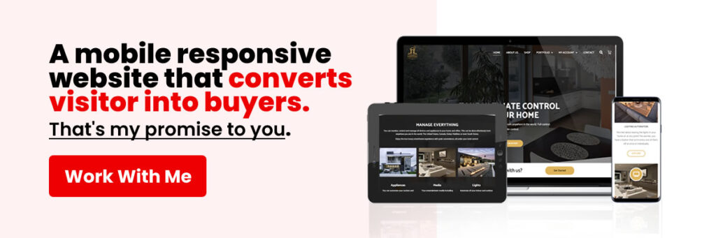
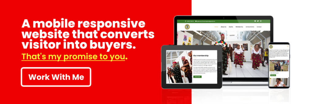
As a web designer in Nigeria, I know how important it is to have a website that looks good and works well on all devices. Feel free to contact me if you need help making your website perform better on mobile devices or redesigning it to be more mobile-friendly. I’d love to help you make your website stand out and get more people to come to it. Remember that if you want to grow your online presence and reach more customers, you need a website that works well on mobile devices. So, do something right away, and let’s work together to improve your website for mobile users.

