Skip to content
 When designing a website, one important factor can significantly affect how your readers feel and what they think of your site: the colour scheme. The colours you choose can make people feel something, send a message, and change how people use your site. That’s why choosing a colour scheme that fits your website’s purpose and speaks to your target audience is essential. This article will show you how to choose the right colour scheme for your website. Whether you’re a business owner, an artist, or someone who wants to create an engaging online presence, we’ve got you covered. So, let’s dive into the world of colour theory and learn how to make your website look good, draw people in, and stick in their minds.

Colour Theory: What You Need to Know
Knowing the basics of colour theory is important to choose the right colour scheme for your website. By learning the basic rules of colour theory, you can make intelligent choices to connect with your Nigerian audience and show what your brand is all about. Let’s look at some of the essential ideas in colour theory.
How the Colour Wheel Works
The colour wheel is one of the most important tools for learning how colours work together. The primary colours are red, blue, and yellow. The secondary colours are orange, green, and purple. Get to know the colour wheel to choose colours for your website.
Warm and Cool colours
These colours make people happy, while cool colours make them sad. Warm colours like red, orange, and yellow make people think of energy, excitement, and life. On the other hand, cool colours like blue, green, and purple make people feel calm, confident, and at ease. When deciding between warm and cool colours, think about the culture and tastes of your Nigerian audience.
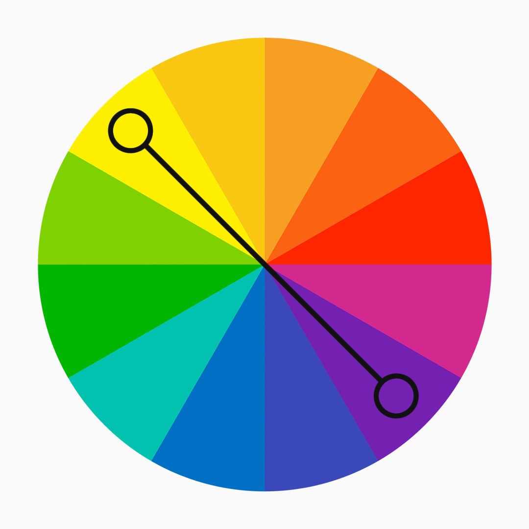
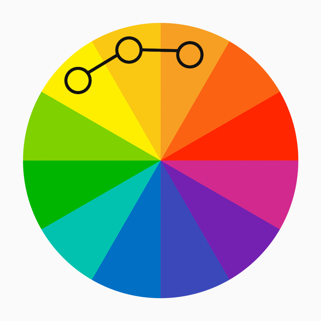
Complementary and Analogous Colour Schemes
Colours opposite each other on the colour wheel, like blue and orange or red and green, are called complementary colours. This colour scheme makes a striking difference and can be used to draw attention to certain parts of your website. On the other hand, colours like yellow, orange, and red are next to each other on the colour wheel. They look like they go together well. Try out both colour schemes to see which works best for your website’s purpose and how you want it to look.
What Colours Mean in Nigerian Culture
In Nigeria, colours can have cultural meanings and stand for things. Green, for example, stands for farmland, fertility, and the country’s lush landscapes. It is often linked to what Nigeria is as a country. In the same way, colours like red and black may mean power and toughness. Use colours that reflect Nigerian culture and ideals to foster a strong connection with your audience.
What You Should Consider When Choosing a Website’s Colour Scheme
There are a few essential things to remember when choosing the right colour scheme for your website in Nigeria. By thinking about these things, you can make a website appealing to the eye and fitting with Nigerian culture, which will help you connect with your Nigerian audience. Let’s talk about these things.
Define the website’s goal and who it targets
Start by making it clear what your website is for. Are you telling people about a business, showing off a product, or giving them information? Knowing what your website is for will help you choose colours that will help you reach your goals. Also, think about the people you want to reach in Nigeria. Different age groups and ethnic groups may have different tastes in colours and how things look. Research what colours your audience likes, and use that information to guide your colour choices.
Showcase brand identity and values
Your website is a part of who you are as a brand. Choose colours that show who your business is, what it stands for, and what it wants to say. If your business is about being sustainable or environmentally friendly, using different shades of green can be a strong choice. Use bold and modern colour palettes if your business is about new ideas and technology. Make sure your colour scheme fits with the look of your brand and gives your Nigerian audience a unified experience.
Consider how colours make people feel
Colours can make us feel things and change the way we act. Colours may have different meanings and connotations in Nigeria than in other places. For instance, red can mean love and danger, while yellow conveys joy and happiness. Think about how you want people to feel and choose colours that make people feel that way. Consider what colours mean in Nigerian culture and make sure your colour choices fit with the message you want to send and get the reaction you want from your Nigerian audience.
Explore accessibility and readability
It is vital to make sure that everyone can use a website. When choosing your colour scheme, think about how easy it is to see and read. Ensure there is enough contrast between the colours of the text and the background to make it easy for people to read the information. This is especially important for people who have trouble seeing or can’t differentiate colours. Use internet accessibility tools to check the colour contrast ratio and make sure the site meets standards for accessibility.
Trying Out Different Colour Schemes
Now that you understand colour theory and have thought about important things to think about when picking a colour scheme for your website in Nigeria, it is time to look into different colour schemes that can improve the look and feel of your site. Let’s look at some well-known colour choices.
Monochromatic

Different shades of the same colour are used in a monotone colour scheme. This makes for an elegant and well-balanced look. For example, if your primary colour is green, you can add lighter and darker shades of green to give your design depth and visual interest. A monochromatic plan works well when you want to show how simple or elegant something is or if you want to show how a particular colour makes you feel.
Complementary
On the colour wheel, colours that go well together are opposite. In Nigeria, you can combine blue and orange or green and red. Colour schemes that go well together create a positive difference and can be used to draw attention to certain parts of your website. This plan works best to make a vibrant design that stands out.
Analogous
Choose colours next to each other on the colour wheel to make an analogous colour scheme. For example, you can mix shades of yellow, orange, and red when similar colours look good together and give your website a sense of unity. This colour scheme works when you want to make someone feel a certain way or show a theme shown by the colours.
Triadic
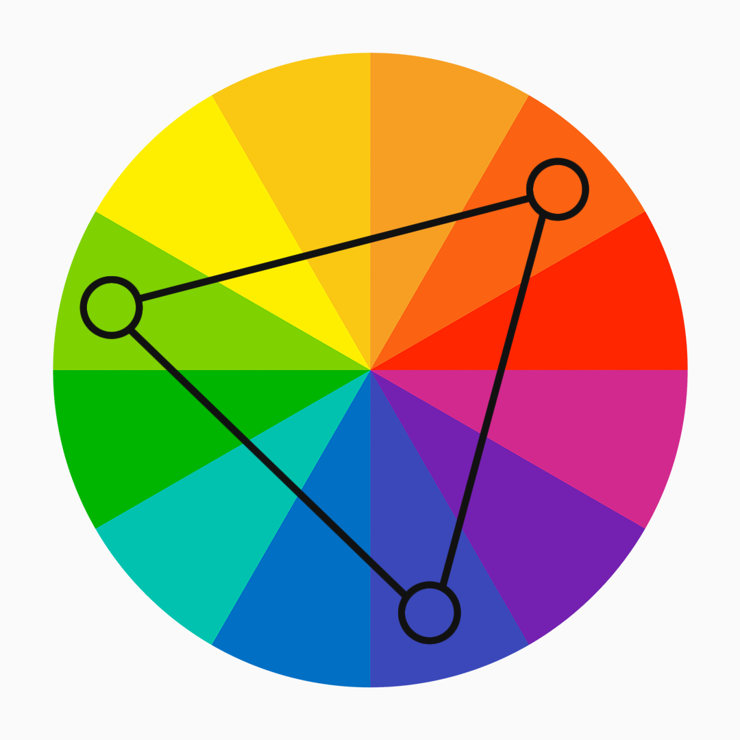
Choose three evenly spread colours on the colour wheel for a triadic colour scheme. You can, for example, mix yellow, blue, and red. Triadic colour schemes look balanced and lively and can be used in many ways. This plan works well if you want to make a website design that is lively and interesting to look at.
Tetradic
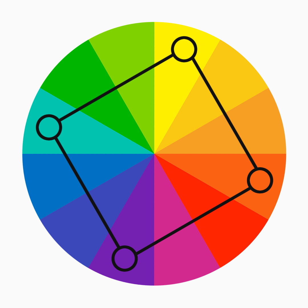
Tetradic colour schemes use two sets of colours that are opposites. This makes the palette more complicated and colourful. You can mix blue and green with yellow and purple, for example. This scheme lets you use a lot of different colour mixtures to make designs that are interesting to look at and move. But be careful when matching the colours so that the whole thing looks good.
Applying Colour on Different Parts of a Website
Now that you’ve looked at different colour schemes, it is time to use those colours on different parts of your Nigerian website. By putting colours in the right places, you can make a design that flows well and looks good to the eye. This will get the attention of your audience. Let’s look at some critical parts of a website where colour can make a big difference.
Header and Navigation
Your website’s header and navigation are the way into your information. Think about using colours that fit with the look of your brand for these things. Use colours that are different from each other to make the navigation menu stand out and be easy to find.
Background and Body Content
The background colour sets the mood and feel of your website. Choose a colour that goes well with your text and makes it easier to read. Ensure there is enough difference between the background and the text’s colour for the best readability. You can choose colours representing your business or culture while balancing how they look and how easy they are to read.
Calls to Action and Buttons
Calls to action (CTAs) are significant for getting people to do what you want. Use colours that make people feel like they need to move quickly, get their attention, and encourage them to do so. Consider using buttons with different colours to make them easy to find and click. Choose colours that fit with your business and get the response you want from your audience in Nigeria.
Links and Text
The colour of links and text makes things easy to read and find. Ensure that links stand out from the rest of the text, ideally by making them underlined or bold. In Nigeria, choose colours that stand out well against the background colour to ensure they can be read. Also, consider using colours matching your company and your overall colour scheme.
Images and Media Elements
Colours can make pictures and other media on your website stand out more. Make sure that the colours in the photos go with the colours you’ve chosen so that the whole thing looks like it belongs together. Pay attention to how the colours in images combine with the text or background colours. Use pictures that show a variety of cultures and speak to your audience.
By putting colours in the right places on different parts of a website, you can make a design that looks good and flows well, which makes the user experience better. Make sure your website looks the same everywhere and that the colours you use fit with your brand and the tastes of your Nigerian audience.
Testing and Iteration
Once you’ve put your chosen colour scheme on your Nigerian website, it is crucial to test and change it to ensure the colours have the desired effect and improve the user experience. Testing lets you get feedback, make changes based on your learning, and improve your colour scheme. Here’s why testing and changing are so important:
How important it is to test
By testing your colour scheme, you can see how well it helps you reach the goals of your website and connects with your Nigerian audience. Do user tests to find out how people see the colours if they make things easier to read, and if they make people feel the way you want them to. Also, test your website on different devices and browsers to ensure it looks the same and can be used on all of them.
Getting feedback from users and other important people
Talk to your Nigerian audience and other important people to determine their thoughts about the colour scheme. Do surveys, interviews, or usability tests to determine how people see the colours if they match the brand, and if they make people feel the way you want them to. Use the comments you got to make your colour choices better and make sure they work for your audience in Nigeria.
Making adjustments based on feedback
Make small changes to your colour scheme based on the comments you get. This could mean changing the shades, the contrast, or how the colours are combined. Aim for a mix between how it looks and how well it works. Ensure the colours make the text easier to read, make people feel how you want them to, and fit with your brand identity and Nigerian culture. Repeat this process until you find the best colour scheme for your group.
Remember that testing and iterating are things that happen all the time. As your website changes and users’ tastes change, it is essential to go back and tweak your colour scheme every so often to keep it exciting and relevant for your Nigerian audience. Gather comments, look at data, and make changes based on what you learn to create a website that looks good and is easy to use.
Tools for Choosing the Perfect Website Colour Scheme
When choosing and tweaking the colour scheme for your website in Nigeria, several helpful tools and resources can make the process easier and help you make intelligent choices. These tools give ideas for colours, help choose colours, and ensure they are accessible. Let’s look at a few of them.
Colour Palette Generators
Colour palette makers are valuable tools for colour schemes based on a particular colour or theme. They give you a choice of complementary, analogous, and monochromatic colour combinations to get you started. Some popular colour palette makers include Coolors, Adobe Colour, and Canva Colour Palette Generator. Try out these tools to find exciting colour palettes that fit with your brand and speak to your Nigerian audience.
Contrast Checkers
Accessibility and reading depend on there being enough contrast between colours. Contrast checkers help you look at the difference between the colours of the text and the background to ensure that you are following accessibility guidelines. You can check the contrast ratio of your chosen colours with tools like WebAIM’s Contrast Checker and Accessible Colors. A contrast ratio of at least 4.5:1 for normal text and 3:1 for large text will help people with vision problems read the text.
Resources on Colour Psychology
Knowing how colours affect people emotionally and culturally can help you choose a better colour scheme. Hubspot’s “Color Psychology: How To Use it in Marketing and Branding” and 99 Design’s “Color Meanings and the Art of Using Color Symbolism” are good places to start. Dribbble’s “How to use color to evoke powerful emotions in your design” explains how different colours make us feel and what they make us think of. Use these tools to help you decide what colours to use and get closer to your Nigerian audience.
Conclusion
Now is the time to use your knowledge and create attractive websites that leave a lasting impact. As a web designer in Nigeria, you can bring in leads and help businesses do well in the digital world. So, do the first thing and discuss your web design needs. Let’s work together to make websites that are beautiful, relevant to Nigerian culture, and easy to use. These websites will have an effect in Nigeria and beyond.
Remember that the right colour scheme can take an average website and make it stand out, drawing people in, getting your brand’s message across, and giving users a memorable experience. Colours are powerful, so use them to make your websites stand out.
Contact Wale Marketer if you want to start making exciting websites in Nigeria.