It’s important to make a logo that says a lot, whether you’re an entrepreneur starting a new business or an experienced business owner looking to update your brand logo. This is where you come into the spotlight. You need to know the dos and don’ts of logo design to make a lasting logo. In this article, we’ll discuss the best practices of logo design and common logo design mistakes. We’ll talk about the best ways to create a logo so that it stands out from the crowd and speaks directly to the hearts of your target audience. But you will also learn how to avoid the mistakes that can ruin even the best-laid plans for design. You will learn how to breathe life into a logo that isn’t just a design but an accurate representation of your brand’s essence. This includes knowing your brand’s soul and avoiding clichés and trends.
Let’s discover the secrets of good logo creation and ensure your brand’s visual identity becomes a beacon of recognition, trust, and admiration. Use the power of your logo to make your brand stand out in a busy market. Let’s go!
5 Best practices for an excellent a good logo (Logo Design Dos)
When it comes to logo creation, it takes careful thought and execution to make a log that captures the essence of your brand. Keep these best practices in mind as you start designing a lasting logo. They will help you reach your goal:
1. Understand your brand’s identity
Before you start designing, take the time to figure out what your business is all about. You must learn about your target audience, study your rivals, and determine your brand’s unique values, personality, and message. By matching your logo to your brand’s personality, you will make a design that speaks to your target audience and shows what your brand is about.
2. Keep it simple and easy to remember
Simple things stand out in a world full of visual noise. You should make a simple, easy-to-remember, and clean mark. A simple logo is easy to remember and will stay in your customers’ thoughts for long. Don’t add extra things to your design that aren’t needed. Instead, focus on making a unique logo that shows what your brand stands for.
3. Use a suitable typeface and colour
Because colours make us feel and think of things, they are an essential part of character design. You should be careful to choose colours that match the style and message of your brand. Also, pay attention to the design. Choose fonts that are easy to read and fit your brand’s style. Your logo will look better and your brand stronger if the colours and fonts work well together.
4. Design your logo to work well in different sizes and devices
A well-made logo should look great on all devices and in all sizes. Your logo should be clear and powerful on a big sign or a small phone screen. Test your logo in different sizes and shapes, and ensure it looks good in colour and black-and-white.
5. Make your logo future-proof
Even though styles come and go, a timeless logo will always be strong. You should fight the urge to follow short-lived design trends and instead focus on making a logo that will last. A timeless logo ensures the brand stays the same and lasts for a long time, vital for building brand recognition and trust.
By following these best practices, you will open the way for a logo that captures the essence of your brand and stands for trust, reliability, and authenticity. Remember that the key to making a good logo is to know your brand, keep it simple but recognizable, choose the right colours and fonts, make sure it can be used in different ways, and make a design that will last forever.
| Dos | Don’ts |
| Know what your company stands for | Use clipart or stock art |
| Make it simple and easy to remember | Make it complicated |
| Use the right colours | Use too much colour |
| Choose a type that is easy to read | Use trendy or illegible type |
| Make sure it looks better with time | Ignore comments and feedback |
Read Also: How to Create a Memorable Logo for Your Business
5 Common logo design mistakes to avoid (Logo Design Don’ts)
While learning and creating logos, knowing what can go wrong and making your logo less effective is important. By not making these common mistakes, you can avoid design disasters and ensure your logo is a strong tool for your brand. Here are 5 things you shouldn’t do:
1. Don’t use clipart or stock art
Even though it may be tempting to take the easy way out and use stock images or clipart, this can lead to a brand that is not unique. You should be original and real since your logo should be a one-of-a-kind reflection of your brand. If you want your audience to remember you, spend time and effort making a custom logo.
2. Don’t make the design too complicated
Don’t fall into the trap of making your logo too complicated by adding too many features and elements that aren’t needed. If your logo is too busy, it can confuse and overwhelm your audience, making it hard for them to remember your brand. Keep it simple and on point to let your brand’s main message come through.
3. Don’t rely too much on colour
Even though colours are significant in logo design, you can’t count on colour alone to convey your brand’s message. A well-made logo should work just as well in black and white as in colour. Think about how your logo looks in black and white to ensure it can be used in various ways.
4. Don’t use the wrong fonts or trending fonts
Fonts are a big part of how the style and tone of your brand come across. Don’t use fonts that are too fancy or hard to read because they can take away from your brand message. Also, don’t be tempted to use trendy fonts because they can go out of style quickly, making your brand look old and irrelevant.
5. Don’t ignore feedback
You might miss chances or things you should have seen when you design a logo in a vacuum. During the design process, get comments from coworkers, friends, and the people you want to reach. Constructive feedback can help you find ways to improve and make sure your logo speaks to the people you want it to. Also, test the logo to see how well it works in different situations and on different devices.
By watching for these common mistakes, you can make a logo representing your brand and standing out. Remember that avoiding stock art, keeping the design simple but powerful, balancing colour and typography, avoiding trendy fonts, and asking for feedback are all important steps in making a logo that reflects your brand with authenticity and distinction. Now that you know what not to do, you have all the tools to make a great logo that will take your brand to new heights. Have fun creating!
4 Real examples of well-designed logos
You can look at real-world examples of logos that have long affected their brands to get a better idea of how powerful good logo design can be. These logos can give you ideas and show you what to do and what not to do when designing a logo. Let’s look at some interesting real-world examples:
1. Apple logo
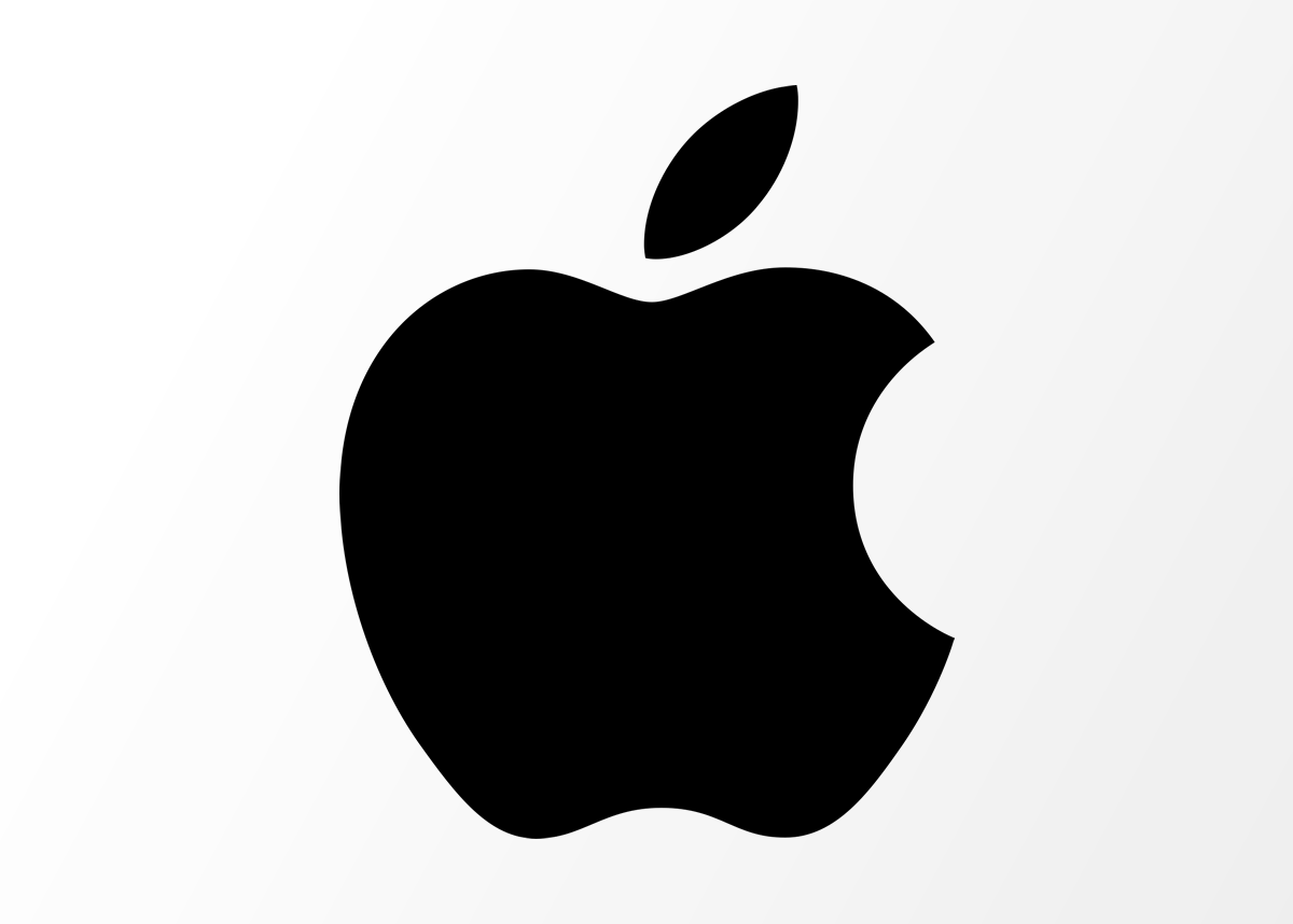
The Apple logo is a great example of why your logo needs to be simple and memorable. The shape of an apple with a single bite taken out of it has become a symbol of innovation and style. This minimalist design is a great example of the “less is more” idea. It shows how a simple, clean logo can stand the test of time and stay current for many years.
2. Nike Swoosh
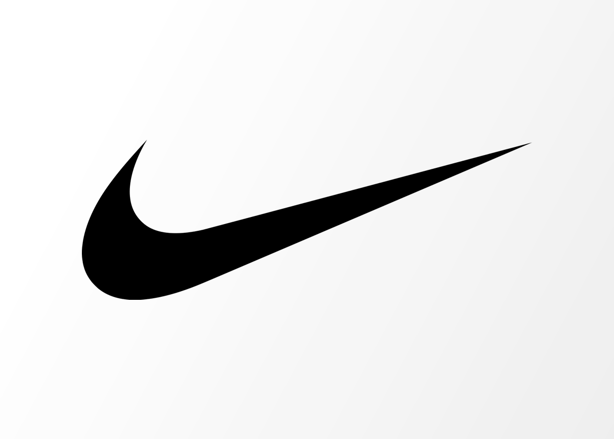
The Swoosh is a symbol of success, speed, and drive. This simple logo, made in 1971 for a small fee, has become one of the most well-known marks in the world. Its fluid and dynamic design shows what the brand is all about and has become an inspiration for players and sports fans all over the world. No matter how scaled down Nike’s swoosh is, it is easily recognizable even in small size.
3. Coca-Cola logo
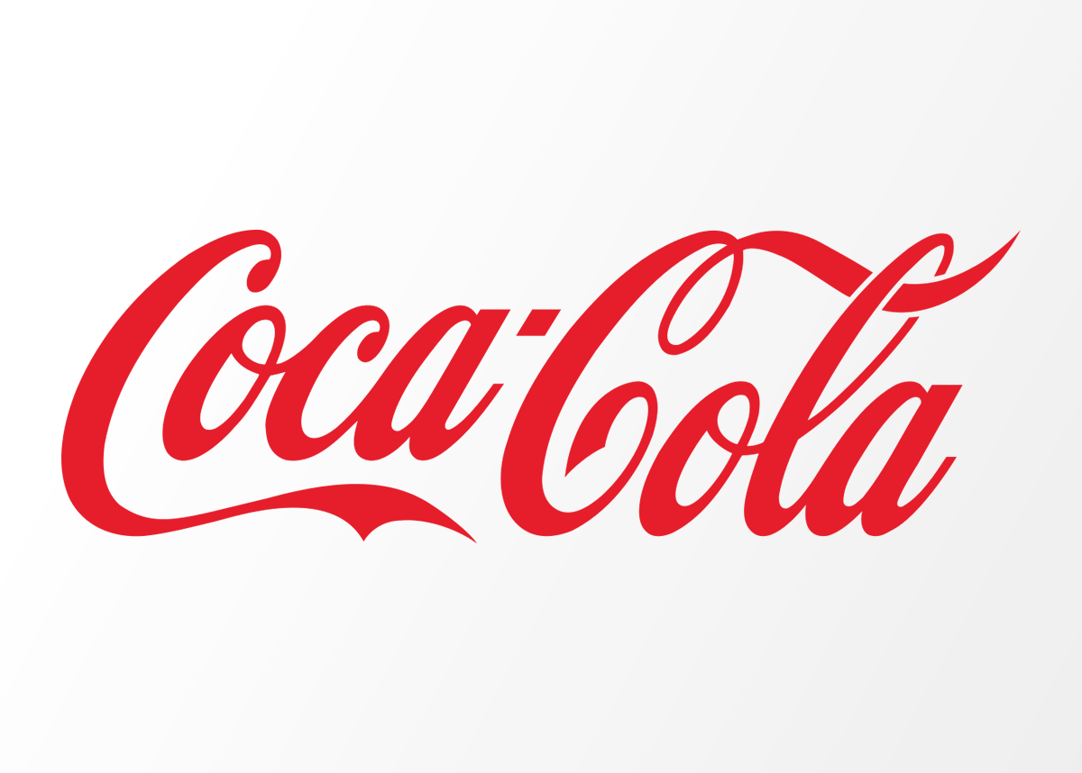
Coca-Cola’s logo has changed very little since it was first made in the late 1800s. The classic script style and bright red colour give off feelings of happiness, warmth, and timelessness. Coca-Cola’s logo shows how important consistency and history are in logo design because people still recognize it worldwide.
Read Also: Logo Design Psychology
4. Target logo
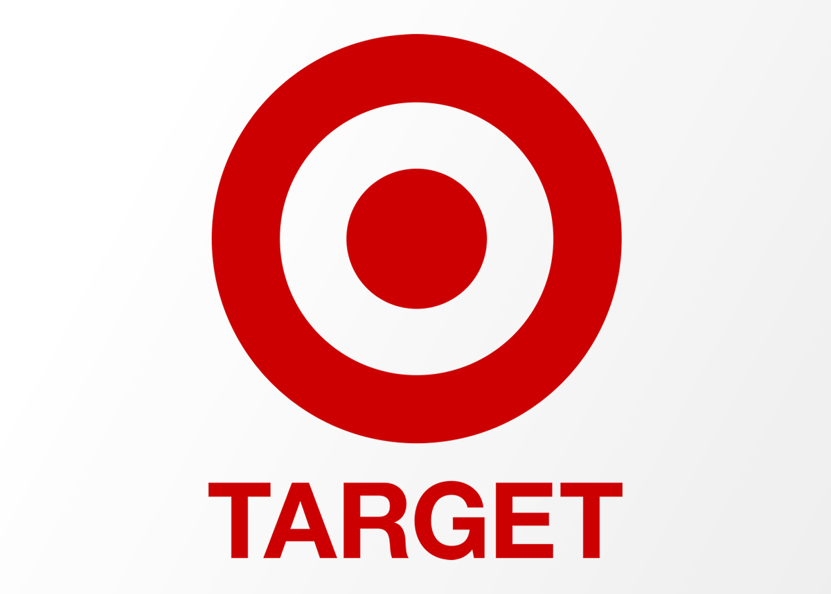
Target’s logo is a simple but eye-catching bullseye shape that shows accuracy and precision. It is easy to recognize because the red and white colours are bright and stand out. Target’s logo is a great example of how a simple, well-made design can make a lasting impact on customers.
These real-world examples show how a strong logo can be a key part of a brand’s personality. They are simple, easy to remember, have a sign, and can be used in many different ways. By looking at these great logos, you can get ideas for your own logo design and learn how important it is to stay true to the essence of your brand. Remember that a well-designed logo can stand the test of time and make an emotional link with your audience that will last. So, let these real-life examples inspire you to start your logo design journey with creativity and purpose.
Conclusion
Your brand should have a logo that shows what makes it special, and that’s where I come in. I can make a logo that becomes the face of your brand and leaves a lasting impact on your customers by combining the best logo design practices with creativity and innovation. As a professional logo designer in Lagos, I am dedicated to making eye-catching and powerful logos, giving your brand identity new life. I understand the dos and don’ts of logo design, so I can make a logo that speaks directly to your target audience and makes your business stand out.