In logo design, it’s not enough to just fill the canvas with colours and shapes; you must also find the right balance between what you can see and can’t. This is where negative space in logo design comes in. Negative space is the intelligent use of negative spaces in your designs to send a message, make people feel something, and build a stronger link with your audience.
Imagine being able to make logos that not only stand out at first glance but also keep the viewer’s attention and make them want to learn more about the minor details they contain. Using negative space to your advantage can make logos stand out and leave a lasting effect on customers. This will help them remember your brand’s message.
In this article, we’ll talk about the idea of negative space in logo design, how it affects people’s minds, and what it means when it comes to making logos. You’ll find out how some of the most famous brands worldwide have used negative space to their advantage by adding secret symbols and double meanings that speak to millions of people.
What is negative space in logo design?
When we say “negative space,” we’re talking about the empty places around and inside the main subject of a design. The lack of visual features is one of the most important parts of the composition as a whole. Like the blank canvas between brushstrokes in a picture, negative space gives your logos life and lets them say more than what’s at first glance.
What is the difference between positive space and negative space?
Positive space includes the shapes, symbols, and words that are the most important parts of your design, while negative space is all about what isn’t there. Imagine a silhouette of a bird against a colourful sunset. The bird represents positive space, and the beautiful sky represents negative space. The brilliance of the design comes from how well these two elements work together.
A well-designed logo in busy markets can leave a lasting impression on customers. Negative space can be used by brands like yours to show hidden meanings, tell interesting stories, and make an emotional link with your target audience that lasts. In the same way, Yoruba Adire fabric uses empty areas to make its patterns stand out; your logos can use negative space to make people curious and interested.
But what really makes negative space in design amazing is how it changes how we see things. As a person looks at your logo, his or her eyes naturally go to the negative spaces, looking for meaning in how positive and negative parts work together. By using negative space skillfully, you can guide the eye of your audience and lead them to the greater message you want to send.
Taking advantage of negative space in logo design
The art of negative space is a powerful tool you can use as a skilled designer to make logos that make a lasting impact on your audience. Using the negative spaces and gaps in your designs to their fullest, you can take your logos to new heights and make visual works that catch the eye and move people deeply. As you carefully move the space around your main elements, you create secret symbols and visual puzzles that make people curious and interested. Here are some thoughts to back that up;
- Imagine a logo for an eco-friendly company in which the negative space inside the main symbol makes a small leaf. Your audience will like the clever design and feel a subconscious link to the brand’s commitment to nature and sustainability. So is the power of negative space. It lets you say more than what hits the eye, which makes it easier to connect emotionally with your audience.
- Using negative space to send two messages makes logos stand out. Think about a logo for a healthcare group where the negative space makes a heart and a person holding hands. This clever use of negative space shows kindness, care, and unity at the heart of what the brand stands for.
- Also, the negative area is key to getting people to recognize and remember a brand. We all know iconic logos like FedEx’s, which has a secret arrow in the space between the “E” and the “X,” and Amazon’s, which has a smile that doubles as an arrow from “A” to “Z.”
- Your driving principle should always be simplicity because it lets the beauty of negative space shine through without being muddled by extra complexity.
- Don’t forget the power of colour, type, and negative space when used together. The way colours and fonts interact with each other can make the most of negative space by drawing attention to the secret parts or blending them into the design as a whole.
The uses of negative space in logo design
In the world of logo creation, creative people have a treasure trove of options when they use negative space in a smart way. As you start to make logos that have a lasting effect, adopting the art of negative space can help you open up a world of visual communication and charm.
1. Creating hidden meanings and symbolism
You can sneak secret messages and symbols into your logos using negative space. Imagine a coffee shop logo where the negative space inside the cup makes a sneaky smile that makes you feel happy and warm. Your audience will be thrilled to find these clever details, making them feel more connected to the brand.
2. Getting people to remember your brand
Logos that use negative space have a special way of sticking in your mind. Think of the famous FedEx logo, where the arrow in the negative space stands for how quickly and efficiently packages can be sent. By making logos with such care, you ensure they stick in the thoughts of the people you want to remember them.
3. Getting two messages across
Combining positive and negative space allows you to send two different ideas in a single design. For example, an environmental group’s logo should include a leaf and a globe in the empty spot to show how committed they are to protecting the environment worldwide.
4. Setting up emotional links with the audience
Negative space can make people feel things and bring them closer together. Think about a logo for an organization that helps people find homes for their pets where the negative space is shaped like a heart to show love and care. These styles make people feel connected to the cause and more likely to support it.
Read also: 7 Elements of an Effective Business Logo Design
8 Tips for using negative space in logo design
As you explore the interesting world of negative space in logo design, here are some tips to help you use the power of lack to make logos that really stand out. With these methods, you, the skilled designers, can make visual masterpieces that make a lasting impression and move people deeply.
1. Start with a solid concept
A solid concept is the basis of every great logo. Before you start designing, take some time to develop ideas and draw them out. Check out how negative space can help your idea stand out and make a more important visual story. An interesting logo starts with a well-thought-out idea.
2. Emphasize balance and Harmony
It is imperative to find the right mix between positive and negative space. Don’t fill up your design with too much negative space because that could make your message less powerful. Seek harmony in your music by ensuring each part goes well with the others.
3. Incorporate negative space harmoniously
The use of negative space shouldn’t feel forced, but rather natural and easy. As you try out different designs, make sure that the negative space makes the whole thing better and strengthens the brand’s personality. Try to make your method simple and beautiful.
4. Consider colours and fonts
Colours and fonts are important parts of logo creation, and they are just as important when working with negative space. Choose colours that go well with the design and think about how different colours work with the blank space in your logo. Also, try out different fonts to find the right mix between being easy to read and looking good.
5. Avoid clutter and overcomplication
Even though negative space can give your logo more depth, be careful not to make the design too busy. Keep it simple and clean, and let the absence say a lot. A cluttered logo can confuse people and make it harder for them to remember your brand.
6. Look at things from different perspectives
Negative space makes it possible for there to be more than one meaning. Try looking at the absence from different angles and points of view to see how it can form different shapes or meanings. This research can lead to logos that are both surprising and exciting.
7. Test and get feedback
Ask people for feedback once you’ve made your negative space logo design. Testing your designs with different people can help you figure out how well the logo conveys the message you want.
8. Think about adaptability
A well-made logo should be flexible enough to work in many different situations. Think about how your logo will look at different sizes, on different backgrounds, and both in print and online.
6 Famous examples of negative space logos
If you consider negative space for your logo, some iconic examples can inspire you. These logos display the power of absence. Shapes and symbols that are cleverly hidden have turned what look like simple logos into timeless works of art.
1. FedEx
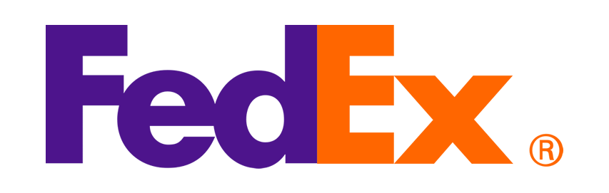
The FedEx logo is one of the most well-known examples of using negative space in a brand. If you look closely, you’ll see that there’s a small line between the “E” and “X.” This arrow stands for speed, progress, and efficiency in the company’s shipping services. Anyone who sees it will remember it for a long time.
2. Amazon

Amazon, the biggest online store in the world, has a clever logo that uses negative space. The famous arrow in the shape of a smile goes from the letter “A” to the letter “Z,” which is a subtle hint at the wide range of products that are offered from A to Z. Amazon’s logo is a one-stop shop for all customer needs is strengthened by this clever use of absence.
3. World Wide Fund (WWF)

The WWF logo is an excellent example of how negative space can be used to send a strong message. The logo is made of mildly disconnected shapes the eyes can connect to form a panda. This logo cleverly shows that the organization’s goal is to protect wildlife and the environment around the world.
Read Also: Logo Design Psychology
4. Baskin-Robbins
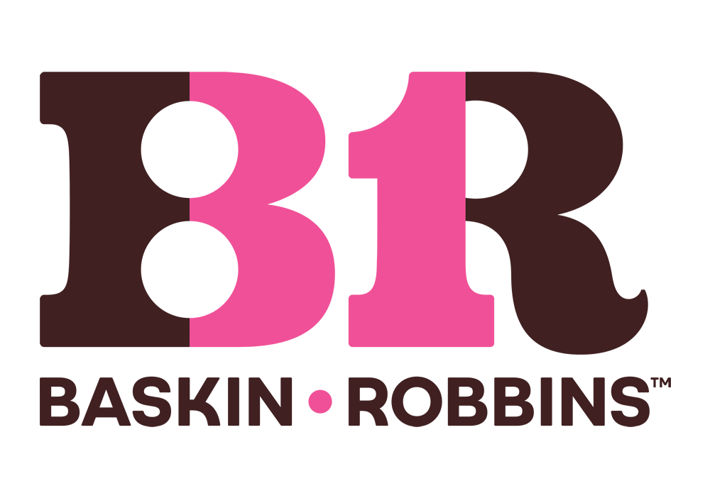
Baskin-Robbins, a well-known ice cream brand, uses negative space in its logo to make it look fun and different. The pink and blue parts of the letters “BR” also make the number “31,” which ties in with the brand’s claim that it has 31 flavours. This is a small but charming detail that draws customers in.
5. Spartan Golf Club
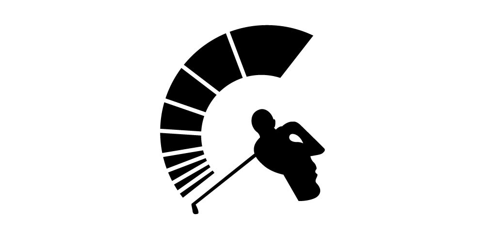
The design for the Spartan Golf Club shows how cleverly negative space can be used in sports branding. At first glance, the logo is as simple as a golfer in action. The path above his head denotes his swing. However, looking carefully, you can see that the path represents a speedometer. Finally, looking at the whole form from a distance, you probably won’t see a golfer or the speedometer. What you see is a silhouette of a Greek soldier wearing a helmet of that era. Sparta was a prominent state in ancient Greece.
6. Tour of France
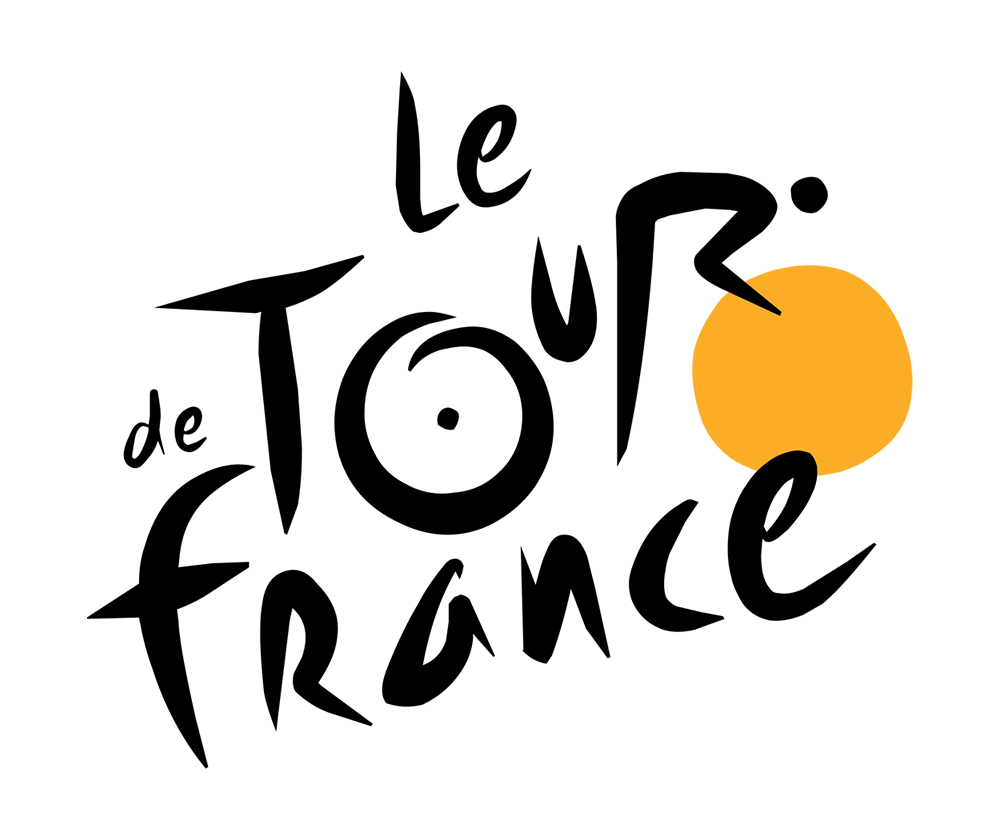
The Tour de France logo shows how even typography can be used to create negative space for a unique and memorable logo. It is easy to miss the symbolism of negative space in this logo if you don’t look carefully. It is all in the word “TOUR.” The letters “O,” “U,” and “R,” along with the circular yellow shape, form a rider on a bicycle. Look again; the letter “R” forms the rider’s body along with a black dot for his head, while the letter “O” is the rear wheel of his bike. This shows that the world-famous cycling event is all about riding.
These well-known examples show how negative space in logo design can make brands stand out and leave a long impression on people all over the world. As you start your design journey, you can get ideas from these well-known logos and use their brilliance to help you make your own beautiful and important designs.
Conclusion
By knowing the art of absence and using negative space in your designs cleverly, you can design timeless logos that connect with your audience and send hidden messages. So, use the power of negative space and let the beauty of cleverly hidden meaning speak for itself in your logos. In logo design, the art of negative space is a powerful tool to make logos stand out and draw people in. An excellent logo can be the key to your brand’s success. It tells potential customers what you do and makes you stand out from the crowd.
If you want your brand to reach new heights, think about how negative space in your logo design could help. As your professional logo designer in Lagos, let me help you make a logo that your target audience will find interesting and meaningful.
Are you ready for your company to say something big? Let’s use negative space art to make a logo that says a lot. Get in touch with me right away to get your logo design job started!