The font you use for your logo can make or break the design. Therefore, it’s critical to take the time to find a font that fits your brand and appeals to your target audience. This article will look at the best logos fonts, emphasizing the Nigerian business landscape. Learn about the pros and cons of classic, modern, script, and display fonts and how you can use them effectively in logo design for Nigerian businesses. We will also look at examples of how different fonts have been used effectively in logo design in Nigeria and provide tips for selecting the right font for your logo. Whether you’re a designer or a business owner in Nigeria, this article will teach you how to create a winning logo with the correct font that resonates with the local market and audience.
This article discusses the significance of font selection in logo design;
- Font’s ability to convey a brand’s message, values, and personality
- Importance of readability in logo font selection
- Various font styles (classic, modern, script, and display) and their suitability for different types of brands
- Pros and cons of using each type of font in logos
- The requirement to test multiple font options before finalizing the logo
- Significance of matching the font to the target audience and considering the market and cultural context.
5 Reasons Why Font Selection Is Important in Logo Design
1. Explains the message, values, and personality of the brand
A logo’s font can convey the brand’s message, values, and personality. A classic font can convey a sense of tradition and timelessness, whereas a modern font can convey innovation and progress. A script font signifies elegance and boldness. The logo’s font can help it resonate with the target audience. An audience-appropriate font can create a sense of connection and relevance with the target audience.
2. Improving the readability of the logo, particularly when it is scaled down
A logo is frequently used in small sizes, such as on business cards or social media profiles, and the font must be legible and easy to read even when scaled down. Therefore, choosing a font that is easy to read in small sizes will ensure the audience can read and understand the logo.
3. Improving the logo’s visual appeal and overall aesthetic
The font used in a logo can significantly impact its visual appeal and overall aesthetic. A visually appealing and easy-to-read font can make a logo more attractive and memorable. You can use a font to give a logo personality and character. The right font can create a logo that stands out and is remembered, whereas the wrong font can create a logo that could be more appealing and forgettable. Using the correct font can make a logo appear unprofessional or attractive. This can harm a company’s image and turn off potential customers.
4. Making the logo memorable
A good font can help a logo stand out and be remembered. Unique, visually appealing, and easy-to-read fonts help a logo become easily recognizable and memorable. A well-designed font can leave an indelible impression on your audience.
5. Effectively communicating the brand’s message
The font used in a logo can effectively communicate the brand’s message. The font appropriate for the brand and audience can aid in clearly and effectively communicating the brand’s message. A logo’s font can create a sense of brand identity. If a font is distinct and appropriate for the brand, it can establish its identity and distinguish it from its competitors.
4 Types of Logo Design Fonts
1. Classic fonts
Classic fonts, also known as traditional or serif fonts, are distinguished by small lines or flourishes at the ends of the letter strokes. Serifs are flourishes thought to have originated in the Roman Empire to make it easier to read text carved in stone. Classic fonts have been used for centuries and have a timeless quality that lends itself well to traditional and conservative brands.
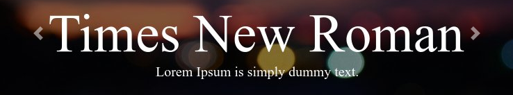
Examples of classic fonts used in logo design
Times New Roman, Garamond, and Baskerville are examples of classic fonts for logos. These fonts are frequently used in logos for law firms, financial institutions, and other businesses that want to convey tradition and professionalism. For example, the New York Times logo uses the Garamond font, representing the newspaper’s long history and credibility.
The pros and cons of using classic fonts for logos
Pros
- Timeless and can convey a sense of tradition, and credibility is one of the main benefits of using them in logos.
- Easy to read in print, making them appropriate for use in small sizes.
- Elegant and sophisticated, making a logo appear more refined and professional.
Cons
- Deemed too formal and serious, making them unsuitable for more creative or casual brands.
- In today’s digital world, where modern and unique designs are often preferred, classic fonts can be easily overlooked or forgotten.
- Difficult to read on digital devices, posing a challenge for businesses that rely heavily on digital marketing.
2. Script fonts
Script fonts, also known as calligraphic or cursive fonts, are distinguished by their letters’ fluid and elegant strokes. These handwriting-inspired fonts are frequently used to convey a sense of elegance, sophistication, and femininity. Script fonts can be formal or casual, ideal for brands that want to convey elegance, luxury, or a personal touch.

Examples of script fonts used in logo design
Brush Script, Zephyr, and Great Vibes are examples of script fonts. These fonts are frequently used in logos for businesses that want to convey a sense of elegance and sophistication, such as fashion, beauty, wedding and event planning, and other companies. The Coca-Cola logo, for example, uses the Spencerian script font, which helps to convey the brand’s mood and timelessness.
The pros and cons of using script fonts for logos
Pros
- Elegant and sophisticated
- Exude femininity, personal touch, and luxury.
- Convey a sense of elegance and luxury, which is ideal for the fashion, beauty, wedding, and event planning industries.
Cons
- Difficult to read, especially in small sizes, and are only sometimes easy to read on digital devices.
- May be too ornate and difficult to replicate, making them less adaptable for use in various media.
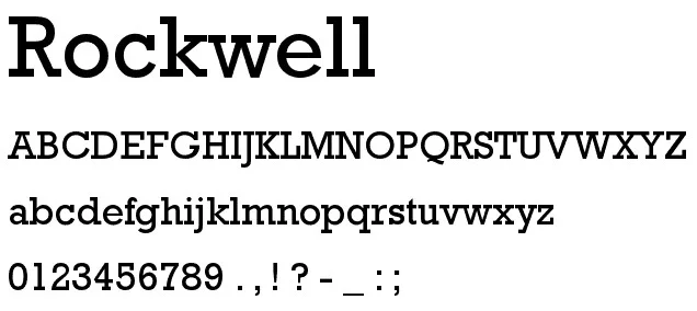
3. Display Fonts
Display fonts, also known as decorative or headline fonts, have a bold and distinct design. They’re intended for headlines, titles, and short phrases. In addition, display fonts can add a distinctive touch to a logo.
Examples of Display fonts in logo design
Impact, Rockwell, and Bodoni are examples of display fonts. These fonts are frequently used in logos for music, entertainment, and other businesses that want to convey boldness and creativity. A modified Rockwell font, for example, is used in the Rolling Stone logo, which helps to convey the magazine’s bold and edgy style.
The pros and cons of using display fonts for logos
Pros
- Bold and distinctive, making a logo stand out and be remembered.
- They can convey a sense of personality and creativity, which is ideal for music, entertainment, and other creative industries.
- Add a unique touch to a logo and make it stand out from the crowd.
Cons
- Can be too bold and overwhelming, making them unsuitable for more refined or professional brands.
- Display fonts, especially in small sizes, can be difficult to read and are only sometimes easy to read on digital devices.
- May be deemed too flashy and unprofessional, making them unsuitable for certain businesses.
4. Modern Fonts
Modern fonts, also known as contemporary or sans-serif fonts, are distinguished by the lack of tiny lines or flourishes at the ends of letter strokes. These fonts first appeared in the nineteenth century to convey a sense of modernity and simplicity. As a result, they have a clean, minimalist design ideal for modern and forward-thinking brands.

Examples of modern fonts used in logo design
Arial, Helvetica, and Futura are examples of modern fonts. These fonts are frequently used in logos for technology companies, startups, and other businesses that want to convey a sense of progress and innovation. The Futura font, for example, is used in the Supreme logo to represent the company’s cutting-edge technology and forward-thinking approach.
The pros and cons of using modern fonts for logos
Pros
- Clean and minimalist, making a logo appear simple and easy to read.
- Adaptable and can be used in various design styles.
- Convey a sense of progress and innovation, which is ideal for tech-savvy and forward-thinking brands.
Cons
- May be too simple and generic, making them unsuitable for more traditional or sophisticated brands.
- Because many businesses frequently use them, modern fonts can be easily overlooked or forgotten.
- Can be difficult to read in small sizes and on printed materials.
3 Tips for Selecting the Best Font for Your Logo
Consider the brand and the target audience.
The brand and audience are two of the most important factors to consider when selecting a font for your logo. Your font should be consistent with the brand’s message, values, and personality and appeal to the target audience. A script font, for example, would be a good fit if your brand is focused on luxury and elegance. A modern font will be a good fit for your brand if it is focused on innovation and progress. On the other hand, a classic font would be a good fit if your brand is focused on tradition and professionalism. You can ensure that the font you choose is appropriate and effective for your logo by considering the brand and audience.
Consider readability
Another factor to consider when selecting a font for your logo is readability. A logo is frequently used in small sizes, such as on business cards or social media profiles, and the font must be legible and easy to read even when scaled down. It is also critical to ensure that the font is readable against various backgrounds and lighting conditions. Additionally, the font’s readability on multiple devices, such as mobile devices, tablets, and computer screens, should be considered. Finally, consider readability to ensure that your logo is easily read and understood by the audience.
Experiment with various options
Testing out different options is one of the best ways to find the right font for your logo. Create several versions of your logo with different fonts, and then solicit feedback from your target audience. Inquire which version of the logo they prefer and which font they believe is the most legible and appealing. You can also test the logo against various backgrounds and lighting conditions. By experimenting with different options, you can get a sense of which font is the most effective and appropriate for your logo.
10 best professional logo design fonts
I compiled a list of ten fonts that are the best for creating a professional logo in the modern world. The last three fonts are freely available online, while the first seven are mostly paid.
1. Futura

Futura remains a popular typeface in print and web design. The Bauhaus design philosophy inspired Futura’s timeless aesthetic, which is simple and stylish. Futura comprises geometric shapes, near-even straight lines, and limited use of curves.
Futura comes in a variety of weights, styles, and widths. Some of them can be found in well-known logos such as Calvin Klein, Domino’s Pizza, and Supreme.
2. Gotham

Gotham has been used in various contexts since its initial release in 2000. You might recognize it from Barack Obama’s presidential campaign in 2008, as well as a variety of other corporate identities ranging from Spotify to GQ (who originally commissioned the design). Unlike other sans-serif typefaces that draw inspiration from Swiss or German design, Gotham was inspired by New York City, specifically the lettering used in early twentieth-century signage.
Gotham is available in eight weights, each with four different widths. It’s one of the best fonts for logos because of its versatility, allowing you to showcase your company name at its best. Gotham ScreenSmart, a slight variation on the preliminary design optimized for web use, is also available.
3. Avenir
Despite being classified as a geometric typeface, Avenir pushes the envelope. Traditionally, these typefaces are based on geometric shapes. However, the “o” in Avenir is not a perfect circle, and its vertical lines are thicker than the horizontals, lending harmony and warmth to this otherwise minimalistic font. It was released in 1988 and inspired by Futura (see below).
There are six weights to choose from light, book, roman, medium, heavy, and black, each with an oblique version. Depending on your brand identity, you can experiment with anything from a light and airy logo design to a more dominant one.
4. Proxima Nova

Proxima Nova has been a popular typeface, particularly on the web, since its release in 2005. It draws inspiration from other popular sans-serifs such as Futura and Akzidenz Grotesk, combining geometric and modern styles into a clean look.
This logo font is available in seven different weights, each with matching italics. There are also three different width options.
5. Separat

This unusual typeface can inject a strong sense of personality into any logo design. The uppercase letters stand out the most, with many of them having “separated” sections, creating an undeniably quirky aesthetic. For example, consider the “M,” “X,” and “K,” which clearly distinguish between the various shapes that comprise them.
Separat was released in 2013 by the type designer duo Gumundur lfarsson and Mads Freund Brunse. Four weights are available: bold, regular, medium, and black.
6. Helvetica Now
The original Helvetica font is the most widely used, especially in branding. Helvetica Now is a redesigned version of the classic Swiss typeface Helvetica. Every single glyph of Helvetica has been redrawn and redesigned for clarity, simplicity, and neutrality in this massive new edition. Helvetica Now is available in 48 weights ranging from Light Micro to Extra Black Display, each with a matching italic. Many well-known brands use Helvetica, including the NYC Subway system and corporate behemoths. In addition, Panasonic, Jeep, and American Airlines are well-known companies that use Helvetica in their logos.
Max Miedinger, Charles Nix, Monotype Studio, Jan Hendrik Weber, and Monotype published Helvetica Now.
7. Mont

Mont is available in ten weights ranging from Hairline to Black, with matching italics. Mont is a balanced but distinct font with distinctive details. The pointed “t” and prominent x-height are two details that make it ideal for solid headlines and outstanding logos. The font supports over 130 languages in total.
Tabular figures and advanced typographic features such as ligatures, fractions, case-sensitive forms, superscripts, subscripts, and so on are all part of the Mont font family. The typeface’s versatility allows it to tackle any graphic design challenge, whether web, print, or motion graphics. Mont was created by Svetoslav Simov and Mirela Belova and is available from Fontfabric.
Three of the best free fonts for professional logo design
8. Raleway

Raleway is a neo-grotesque typeface, which means it has a clean, straightforward design and is similar to popular fonts such as Helvetica and Arial. However, there are a few unique touches that make it stand out. First, it has a sophisticated appearance, with a subtle and unexpected tail on the lowercase “L” and a crisscrossed “W.”
Raleway, a single thin-weight typeface by Matt McInerney, has since grown into a family of nine weights designed by Pablo Impallari and Rodrigo Fuenzalida. As a result, you can now enjoy it in all its various forms, from thin to black, as well as italics.
9. Poppins
You are probably wondering why I didn’t add an image of what this font looks like, right? I didn’t add an image because you have seen enough of this font for the day 😉 The font I chose for my personal branding is Poppins. All you have read so far is written with the Poppins typeface. I also design images on my Instagram and texts in my videos with Poppins.
Poppins is a multilingual font that you can use in both Latin and Devanagari writing systems. It’s a traditional geometric typeface composed of perfect circles and based on geometric shapes. The overall look is clean and straightforward, with almost all lines being the same width across all letterforms.
Poppins is one of the best fonts for logos with a minimalistic aesthetic, and it comes in nine weights with matching italics.
10. Roboto Slab

Despite its prominent serifs and primarily geometric forms, Roboto Slab retains a softness. This neo-grotesque typeface has the advantage of making font pairing simple, as it was designed to be used alongside its sans-serif counterpart, Roboto, also a free font. The two contrast while forming a look that can function well as part of a larger visual identity.
Roboto Slab, created by Google as a system font for their mobile design, is available in nine weights ranging from thin to extra-bold and black. Roboto also comes in a condensed version and supports Cyrillic and Greek.
Conclusion
Selecting the right font for your logo is critical to developing a successful brand image. The font you choose can convey the brand’s message, values, and personality and affect the logo’s readability and visual appeal. So whether you’re a designer or a business owner in Nigeria, it’s critical to find the right font that fits your brand and appeals to your target audience.
Keep the brand and audience in mind, consider readability, and experiment with different options when choosing a font for your logo. By following these guidelines, you can ensure that the font you select is appropriate and effective for your logo.
As a logo designer in Nigeria, it’s critical to stay current with design trends and font selection and keep in mind the specific needs and preferences of the Nigerian market and audience. You can create logos that resonate with the local market and stand out from the competition by staying informed and up-to-date.
In short, a well-designed logo with the appropriate font selection can make or break a successful and memorable brand image. So, as a logo designer in Nigeria, take the time to research, test, and choose the best font for your next logo design project.
Please contact me if you require a logo designer in Nigeria. I can assist you in developing a solid brand for your company and making it stand out in the crowded Nigerian market.


