If you do your research on types of logos on the internet, you’ll find articles talking about as many as 11 types of logos. I’ll keep it local based on my experience working with Nigerian businesses. Here are 5 types of logos for businesses in Nigeria.
The 5 Different Types of Logos in Nigeria:
- Wordmark — This type of logo is a designed version of the company name. It works best if the company name is just one work e.g. Google.
- Lettermark — Like wordmark, Lettermark is also a designed version of an acronym of the company name. It works for companies having more than one word in their name, e.g. BBC.
- Brandmark — A very simple and unique shape that identifies a brand. This works for brands that are already well known and have enough marketing power to popularise the logo, e.g. Apple.
- Combination mark — A combination mark contains both a brandmark and either a wordmark or a Lettermark. This is great for new brands, e.g. Kuda.
- Emblem — This logo is restricted within a shape and carries a connected mark and letters. Individual elements of an emblem won’t do any good outside the emblem, e.g. most school badges.
You have probably noticed that a logo can be a pictorial icon (called a mark) or a well-designed font from a typeface.
Some types of logos for small businesses include both marks and fonts.
What type of logo is best for a company?
Logos take any form, from pictorial formats to letter formats.
The properly designed logo gives your business a distinct look and feel. Also, the logo is memorable with a combination of text and/or pictorial form.
Your logo is your first impression on anybody, it needs to be a memorable one.
There is no perfect type of logo; there are pros and cons to using each type of logo for your business.
I’ll state the pros and cons of each type of logo using examples of logos I have designed where necessary.
Wordmark
A wordmark logo is a simple logo that spells out your company name in text only. Common examples in Nigeria include Coca-Cola, Google and Bet9ja.
Wordmarks can stand on their own and use a unique font or vector design. If a common font is used for the logo, it needs to be modified to make it yours.
Wordmarks work well for companies with short and catchy names. Therefore, when people remember the company name, they visualise the simple logo.
The font used needs to align with the brand’s industry.
For instance, financial or legal businesses use thick, legible fonts which portray them as balanced and safe. Fashion brands use elegant fonts that portray them as luxurious.
Pros
- Since the logo itself is a writing of your company name, it helps your brand name stick in people’s heads.
- It is easy to use across online and offline marketing processes. You can have a white format for dark backgrounds.
Cons
- Your logo could get lost amongst similar logos, especially if there’s nothing unique about it.
Tips for using wordmark logos
- Letters (type) are the main elements of a wordmark. Therefore, the memorability of your logo depends on the typeface or font used. Use a font that reflects your target audience’s perception of your brand or Industry.
- Distinguish your logo with an alteration in the text block. You can arrange your texts randomly like in Yahoo! old logo or add a modification to a letter, like the Visa logo. Such modification prevents people from seeing your logo as a word or just text.
- Choose a unique brand colour to give your logo a distinct look.
Lettermark
Lettermark logos are simple logos made up of the company’s initials. Common examples in Nigeria include GIGM (God is Good Motors), NCC (Nigerian Communications Commission) and TC (Tech Cabal).

Lettermark logos are simplified and easier to remember than when the company uses their full name. Hence, they work!
Lettermark logos are great for companies with long names or government bodies.
As with wordmark logos, if typefaces are used in lettermark logos, they need to with the brand’s industry.
Pros
- Lettermark logos simplify long and excessive brand names. This helps people recall them quickly.
- They fit different spaces and are easy to use for marketing purposes.
Cons
- Lettermark logos need expert attention to be distinct and memorable. Think about the BBC logo, it is just BBC in squares, anyone can do that! The logo design company visualized the logo for the future, BBC trusted them, and it worked out in the end.
Tips for using Lettermark logos
- Lettermark logos are meant to be very simple. People should be able to read out the letters of the acronym. Uppercase letters are the safest to use.
- If you are a new business, it is wise to add your full brand name close to your acronym design. When people see this, they get to know what the acronym means.
- If your letters are not custom-designed, ensure that the typeface chosen to carry your acronym is distinct and portrays your brand well.
Brandmark
Brandmark logos are made up of a specially designed icon, image or symbol to represent the company. Common examples in Nigeria include Shell, Ventures Platform and Apple.
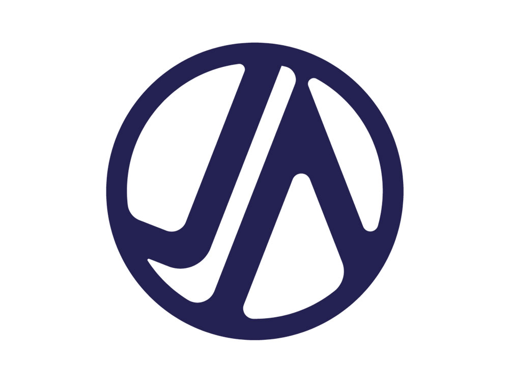
Usually, the icons in brandmark logos represent something the viewer can easily decipher e.g. apple in Apple.
Brandmarks are simple icons that are meaningful to the brand that uses them and understandable by their audience, e.g. the tennis racket and motion effect in the ATP logo.
Pros
- Brandmark logos are simple and memorable – you sell bags, how about a simple red bag icon.
- They are easy to resize for use in various marketing processes.
Cons
- They don’t work well without text for new brands – imagine a new company using a pineapple logo without stating its name somewhere else.
Tips for using brandmark logos
- Use symbols that people can easily relate to your industry. For instance, a master Japanese sashimi chef wants a logo. A Deba knife is a great tool used by sashimi chefs. However, most people he serves don’t know (or care) about this. A fish would probably serve better.
- New businesses or small businesses need to add their company name underneath their brandmark for identity.
- Don’t use an icon or symbol that’s trending at the moment for your brandmark. Your brandmark logo could change over time; however, a solid foundation icon ensures that your logo does not break completely from where you started.
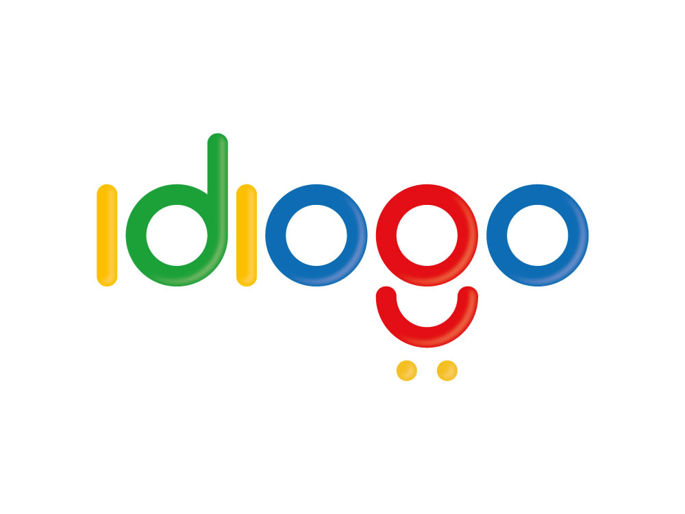
Combination Mark
This is the most popular type of logo. It is made up of both a brandmark and a wordmark – hence ‘combination’. Common examples in Nigeria include PiggyVest, Paystack and Bella Naija.
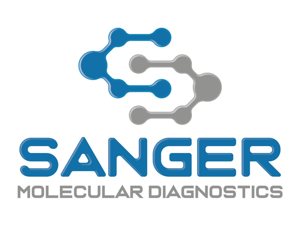
Combination mark logos consist of both images and text in their design.
They make great logos for startups and present your target audience with a memorable reminder whenever they encounter your business.
This helps forge brand retention for your small business as time goes by.
Pros
- Combination mark logos are very useful in cementing your brand mark in people’s minds. They see your mark and read your name. Over time, they’ll be able to recognise the brand icon even when the name is not attached.
Cons
- None I can think of. If done properly, your combination mark logo fits any marketing purpose.
Tips for using combination mark logos
- Less is more. Keep your logo simple so people can easily recall it.
- Be sure the brandmark you choose relates to your business and its core values.
- Align your image and text logo elements properly and keep them that way.
- Get your combination mark logo in two forms: with the image above the text and with the image beside the text. The latter could help with your website.
- Ensure that there is sufficient space between the two elements of the logo.
Emblem
Emblem logos are made up of symbols (brandmarks) integrated with the text. Both elements are fused to form a compact unit that can’t function independently. Common examples in Nigeria include the Nigerian coat of arms, UNILAG logo and Enyimba FC logo.
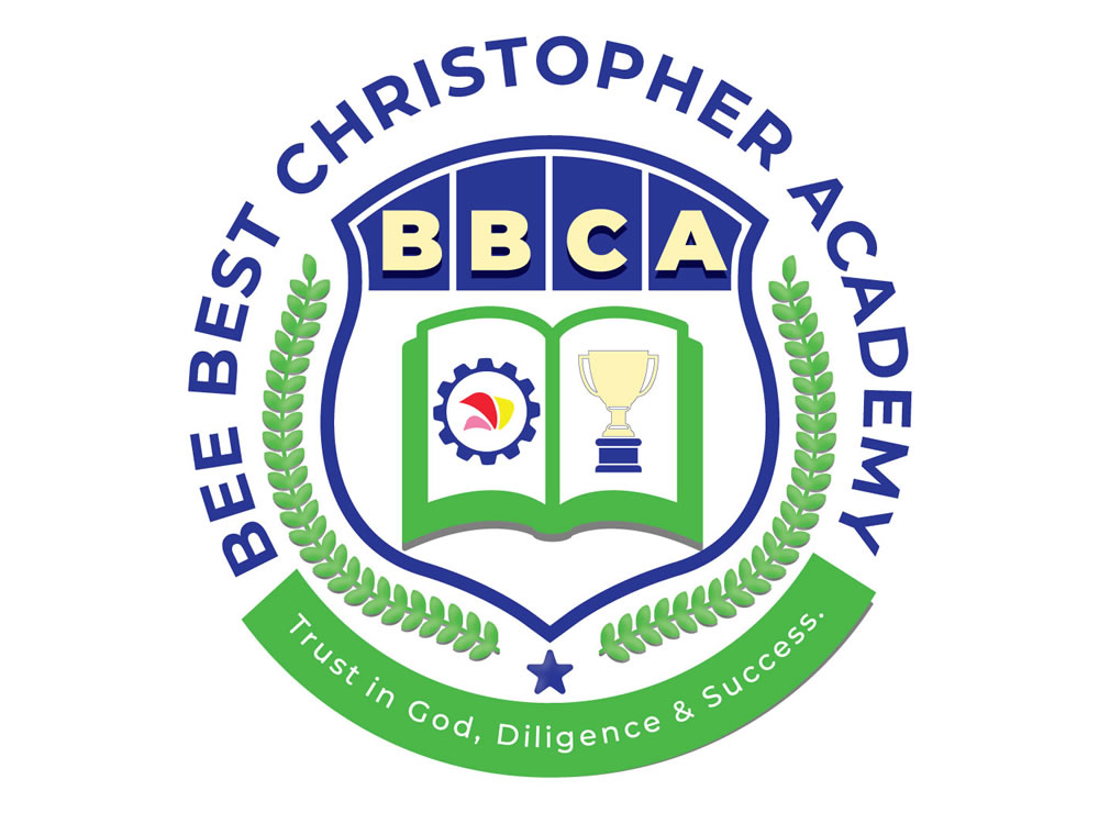
Since emblems are mostly used for logos of armed forces, football clubs and educational institutions, they carry an aura of loyalty and respect.
Therefore, emblem logos can provide your brand with an impression of heritage and competence.
Pros
- Emblems give your company an ancient, enduring impression. Your target audience senses history and legacy by looking at your emblem.
- They look great on merch and clothing. Therefore, they are great for football clubs and schools where jerseys and uniforms are worn, respectively.
Cons
- Unlike combination mark logos, emblems are poor when scaled down. Designs integrated into emblems are not visible when scaled down.
Tips for using emblem logos
- Be careful with details in your logo as they are likely to disappear when your logo is scaled down.
- Emblems are difficult to redesign due to their complex nature. Be sure you are satisfied before signing off on your emblem logo.
There are other classifications of logos, including abstract marks, letterforms, mascots, and dynamic mark logos.
However, these types of logos are modifications of the five types above and are not commonly used or understood by small business owners in Nigeria.
Which type of logo should I choose for my business?
I have highlighted the pros and cons of the types of logos above.
In practice, however, there is no law guiding the type of logo you should commission for your business.
Through deep research and consultation with you, your logo designer determines the best type of logo for your business.
However, you know how you wish for your brand to be represented. Therefore, you have to sign off on whatever your logo design expert does.
Make sure your logo works for your industry.
Do you need a logo now?
Yes, I am here for you.
Start by checking out my graphic design portfolio to see my past logo designs.
Perhaps you noticed, all the logos used in this article are logos I created for my past clients.
You can fill out my logo design questionnaire to get started with your logo.
Let’s get this started 😉